Trivia
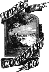
Apple’s first logo, designed by Steve Jobs and Ronald Wayne is a logo showing Sir Isaac Newton sitting under an apple tree. As the first logo design was perceived to be a bit too complex and hard to view, it got replaced almost immediately by this rainbow silhouette of an apple. This apple logo, like the first one designed by Jobs and Wayne, is also almost definitely a tribute to Isaac Newton's discoveries of gravity (the apple story) and the separation of light by prisms (the colors of the rainbow).

But regarding to Regis McKenna and Associates who worked on this new 1976 logo and who added the ‘bite mark’ to it, the logo also symbolizes the concept of seduction of the customers and the marketplace in general. The rainbow-colored logo is a reference to the Biblical story of Adam and Eve in which the apple represents the fruit of the Tree of Knowledge. It brings to mind that people must pursue their dreams. While this was not initially a deliberate goal, it did encourage business and consumers to consider the Apple brand for the first time and was successful in generating increased profits.
Still today this silhouette of the apple with the bite taken out together with f.i. Nike’s swoosh is one of most famous corporate brands throughout the entire globe. It got stylized even more and was updated in 1998 to a one colour shiny silhouette matching Apple’s innovating colored translucent products at that time. Again it set a trend in logo design. Just like Apple was a branding pioneer (for one moment forget the Beatles with their record label) by placing a fruit logo on their high-tech computer products in 1976, they now at the end of the last century transformed their logo to one of the first 3d shiny, web2.0 avant-la-lettre, logos.
Source: http://en.wikipedia.org/wiki/Apple_Inc.#Logos
|