Trivia
Again in 2008 Pepsi launched a new logo. The circle of the previous logo remained, but the type of the word mark changed drastically; compared to the old typeface it is very thin and more subtle. The circle still has the same colors, but has a more stylized white stripe and now looks like a smiley. Some even say it looks like Pac-Man. The white stripe is now also no longer a wave-shape or tilde. The wave element moved from the circle to the 'e' in the Pepsi name.

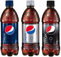
The logo is proposed to be applied differently on Pepsi’s cola products. Regular Pepsi packaging should show the normal logo as above. But the Diet Pepsi products would show a logo with a smaller gap or ‘grin’ and Pepsi Max packaging should show a bigger than the regular gap as a smile. Although it is doubtful consumers will note this slight difference in logo application, it is subtle and therefore very tastefully done by Arnell.
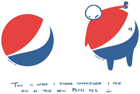
Luckily for our entertainment not everybody sees the same in logos or in this case sees a smiley in the the 2008 Pepsi logo. Some people see other bodyparts in it….

© 2009 Lawrence Yang - blowatlife.blogspot.com
|