
|
TriviaMTV's 2010 logo is more rounded and contains less lines than the original 1981 logo. The subtext 'Music Television' in the logo disappeared. Also it looks a bit like the legs of the capital M got chopped off in some way. Anyway got shorter for sure as also the bottom of the T disappeared in endless whitespace.
The new logo is extremely suitable and probably intended as a better mask to be applied on all sorts of photographic and graphic images. In the current digital media era we live in, we more and more see that a logo like this is more loosely applied, take for the instance the Google logo, applying all sorts of daily doodles on, and f.i. the new 2009 AOL, America Online logo.
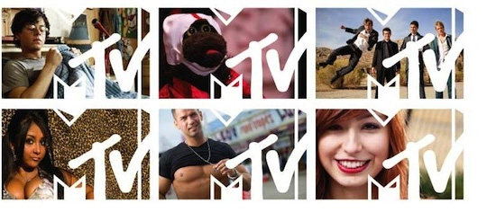
Maybe this new logo isn't as charactericstic as its predecessor, it does remain its unique elements and makes a new way of applying and adapting the logo to various media expressions possible.
|
| |
|
|
