goodlogo!com Home
Surprise Me ;-)
Search
The Q8 Design Case
share this page:
Design Cases
ABN-AMRO
AEG
Ambigram Logos
Apple Macintosh
AT&T
BMW
Brand Branding
Browser logos
Coca-Cola
CorpGroup Holding
Datapas
Exxon Oil
Fiat Automobilia
GoodLogo Story
Honda-Acura
ICI
KPN Brands
Macromedia
MasterCard
McDonald's
Michelin
Nike
NS Dutch Railroads
Olivetti
Olympic Games
Pepsi
Peugeot Logo Evolution
Popstars and Bands
Public Transport

Q8
Renault
Shell
Skyteam Members
SNCF (French Railway)
Sony
Star Alliance Members
Starbucks Logo Evolution
TV Stations
United Parcel Service
Wella
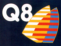
Q8 logo

1986

Q8

In a bid to expand its retail petroleum business into the international market, Kuwait Petroleum took the radical step of completely changing the name of its subsidiary company, Gulf Oil. Gulf became Q8 in Europe in 1986, based on the English pronunciation of Kuwait.
Its symbol of twin sails refers to traditional Kuwaiti trading ship, and the bright color combination is intended to improve the visibility of the gas stations in the dark. The new identity was created by Wolff Olins.

The following logo holds a reference to this case: Q8 (1986)

Username    Password