Trivia
De Bijenkorf (literally: The Beehive) is a chain of upmarket department stores in the Netherlands.
The logo was introduced in 1953 after creative director Martin Lederman asked Swiss graphic designer Josef Müller-Brockmann to design a new, austere corporate identity for the Bijenkorf department stores.
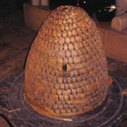
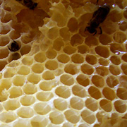
Inside the hexagon, the logo shows the outline contour of a stylized classic beehive. The hexagon itself refers to the internal structures of a beehive that comprise a densely packed matrix of hexagonal cells made of beeswax, called a honeycomb.
 |
 |
| A classic beehive |
Honeycomb hexagonal structure |
Founded in 1870 as a small store, it offers many prestigious fashion brands in womenswear, menswear, accessories, beauty, food, and home. De Bijenkorf is currently owned by Maxeda (formerly known as Vendex/KBB), which also owns the lower positioned department stores Vroom & Dreesmann and until sold in 2007 the HEMA.
|